
Tokyo Hiro brings the Year of the Snake to life on Sapporo Premium’s limited-edition cans and packaging.
What happens when centuries of Japanese tradition meet cutting-edge artistry on a sleek aluminum canvas? Magic. Sapporo’s Year of the Snake artwork is more than just packaging, it’s a celebration of culture, design, and craft. Following the success of 2024’s Year of the Dragon cans, Sapporo has once again teamed up with the acclaimed Japanese designer and tattoo artist Tokyo Hiro to create another visual masterpiece that brings together iconic art and premium beer for the Year of the Snake.
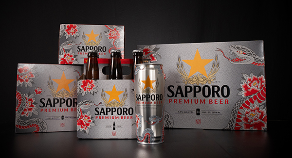
Now through March, Sapporo Premium cans and packaging once again feature original artwork created by Hiro to celebrate the Year of the Snake. This year, the artist created visually arresting snake and peony art in his distinct east-meets-west style. The Year of the Snake art covers all Sapporo Premium package types, including the brand’s iconic 22 oz. cans. It features two snakes, one with an open mouth – traditionally used in art to ward off evil spirits – and one with a closed mouth – traditionally used to keep in good spirits. The two together are representative of the end and beginning of the new year. Because of its significance as a lucky number, eight peonies surround the snake. The background is inspired by a traditional kimono pattern: The Seigaiha pattern symbolizes a peaceful sea, quiet strength, and good fortune. Every detail was carefully curated for a package as artistic as the beer itself.

“Sapporo has given me such an amazing opportunity to show my work and honor Japan,” Tokyo Hiro said. “East-meets-west has always been my tattoo style and that’s a guiding principle of Sapporo’s brand too.”
Commenting on Hiro’s decision to include peonies in his design, Sapporo-Stone Senior Vice President of Marketing Erin Smith said, “It was Hiro’s idea to bring some softness to the design to balance the aggressiveness that snakes can put off and there are eight peonies because that is the good luck number of the wood snake.” Peonies, specifically in Japanese culture, stand for wealth, honor, and good fortune.
The color choices are equally captivating. Leaning into color for this year’s design differs from the previous Year of the Dragon. The color red has ties to the new year and good luck and also works with Sapporo’s branding. On the 22 oz. cans, these crimson tones stand out against the sleek metallic finish, creating a layered effect that feels both vibrant and refined.
The Year of the Snake design offers a visual and cultural experience that pairs beautifully with the premium beer inside the can. It’s a celebration of art, tradition, and innovation. By collaborating with Hiro, Sapporo has transformed simple packaging into a canvas that blends cultural heritage with contemporary design. The intricate details, rich symbolism, and stunning aesthetics really make this packaging stand out.