
Lagunitas Brings Back Iconic Elements with a New Look
Lagunitas Brewing Company’s recent package refresh is more than just a facelift, it’s a strategic move designed to reinfuse the brand with personality while standing out in the crowded craft beer landscape. At the core of this transformation is a focus on balancing heritage with creativity, packing both nostalgia and modernity into every design. “We wanted a design that stood out in the sea of IPAs, aiming to improve our findability on shelf, to highlight the trust and quality that consumers can have within our products, and to create a badge value for a brand that consumers want to be seen with,” Lagunitas CMO Hannah Dray told Craft Business Daily.
In true Lagunitas fashion, the redesign embraces the quirky, playful side of the brand. Lagunitas’ in-house marketing and design teams sought to bring that eccentric spirit front and center, ensuring that the packaging reflects the boldness of the liquid inside. The result is a thoughtful, yet unpretentious, aesthetic that speaks directly to loyal fans while enticing new drinkers with a more inviting shelf presence.
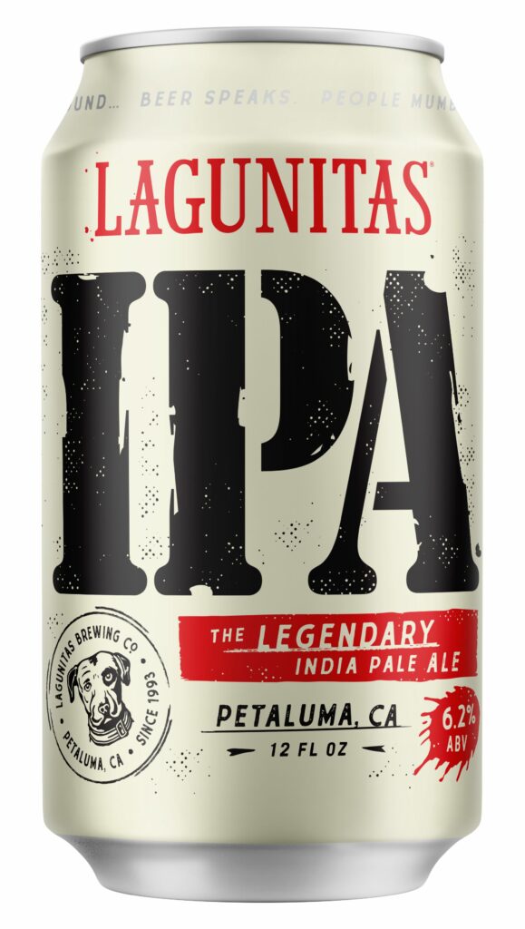
The new design of their flagship IPA brings back the iconic “three-letter” style in a big, bold way – reminding drinkers why they fell in love with the beer in the first place. It’s not just a logo, it’s visual shorthand for the brand’s identity. “We needed to ensure that Lagunitas IPA was the first they see and reach for,” says Dray. The addition of an ink splotch, a subtle nod to the brand’s counter-culture roots, injects a sense of rebellious creativity that Lagunitas is known for. These elements do more than just fill the space, they add a dynamic texture that evokes the brand’s unconventional origins.
For A Little Sumpin’ Sumpin’, the return of the pin-up girl, Millie, creates an air of cheeky nostalgia and reconnects with long-time fans who’ve missed her. “We heard loud and clear that everybody wanted us to get even closer back to the original Millie,” says Dray. Millie’s reappearance on the packaging feels intentional, it’s not simply a callback for the sake of it, but a well-placed wink to loyal consumers. With this reintroduction, Lagunitas reaffirms the emotional connection drinkers have with the brand, while adding a touch of vintage charm.
The overall visual language of the new packaging can be described as playful and character-driven yet rooted in simplicity. Rather than overwhelming the consumer with cluttered details, the designs rely on familiar icons and bold typefaces that are easily recognizable on a shelf.
Lagunitas isn’t simply slapping a logo on each can, they’re creating packaging that tells a story, where each beer’s personality is given room to breathe. The result? A line of products that’s cohesive but still gives each brew its moment in the spotlight. “We’ve been very focused on making sure the new packaging communicates what the brand truly stands for,” Dray says, which includes “authenticity, high quality, fun, refreshing, smooth finish and rich flavor.”
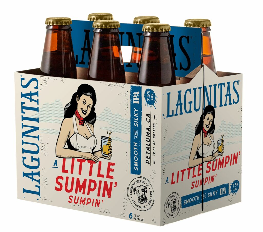
Early signs suggest that the rebranding is paying off. Since the new Lagunitas IPA packaging hit the market in late May, the brand has seen a 6% increase in velocity compared to the previous 13 weeks, with sales also up compared to the previous year. This positive momentum is encouraging as the company just recently rolled out the new packaging for A Little Sumpin’ Sumpin’ and the rest of the portfolio will follow in early 2025.