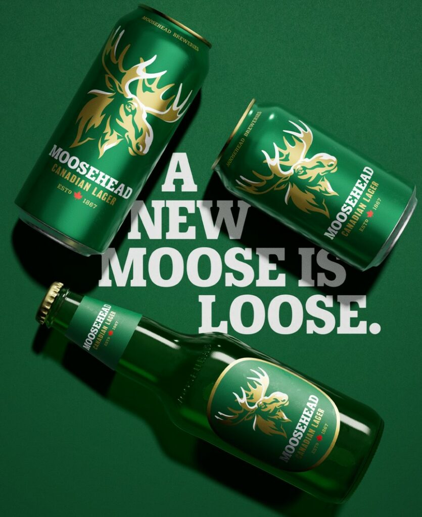
New Antlers, Same Moosehead.
In the competitive world of beer, staying relevant and appealing to evolving consumer tastes is essential. And so, Moosehead, one of Canada’s oldest and most iconic breweries, recognized the need to rejuvenate its image and connect with a new generation of beer enthusiasts. Fresh colors and imagery have breathed new life into the company’s identity, without detracting from this brand’s incredible legacy and heritage.
Kris Sjolander, Vice President of Brand Development for US Beverage (Moosehead’s importer) explained that, first and foremost, focus was placed on the moose. Said Sjolander, “Our majestic symbol was carefully redesigned and given added space.” The old moose was replaced with a sleeker, more dynamic design that is more lifelike to better convey the true spirit of the brand and its connection to nature.
“I love that the new design incorporates classic Moosehead callouts like ‘Canadian Lager’ and ‘Est. 1867’ but with more modern fonts and great use of gold, giving it a premium and fresh look.”
– KRIS SJOLANDER, Vice President of Brand Development for US Beverage

Color was also considered. Moosehead Lager packaging is now more vibrant. Sjolander explains, “Both updates were intended to give the packaging more of a pop on the shelf, and I think that goal was certainly achieved.” The updated elements came together beautifully, making the packaging stand out on store shelves.
Moosehead’s new look has been met with enthusiasm. “I love that the new design incorporates classic Moosehead callouts like ‘Canadian Lager’ and ‘Est. 1867’ but with more modern fonts and great use of gold, giving it a premium and fresh look,” said Sjolander. “This balance really seems to appeal to all current and potential new Moosehead customers. It’s important to note, though, as you’ll see on our new POS… we may have new antlers, but it’s still the same amazing Moosehead Lager!”
