
Dogfish Head’s Package Refresh: Crafting a Consistent Story
Founder Sam Calagione discusses his efforts to align brand image with craft spirit.
Sam Calagione, founder of the award-winning, and still “Off-Centered” Dogfish Head Brewery has a lot in common with British rock legend Rod Stewart. Both men know (almost on a cellular level) that “Every Picture Tells a Story.” This title track of Stewart’s breakthrough 1971 album was one of eight songs that revealed his distinctive vocal style described on the website dcsaudio.com as “a mixture of folk, rock and blues, with flashes of London art school cool and American country.”
Artists are rarely one dimensional. Each one has at their disposal an arsenal of talents they bring together to deliver something unique.
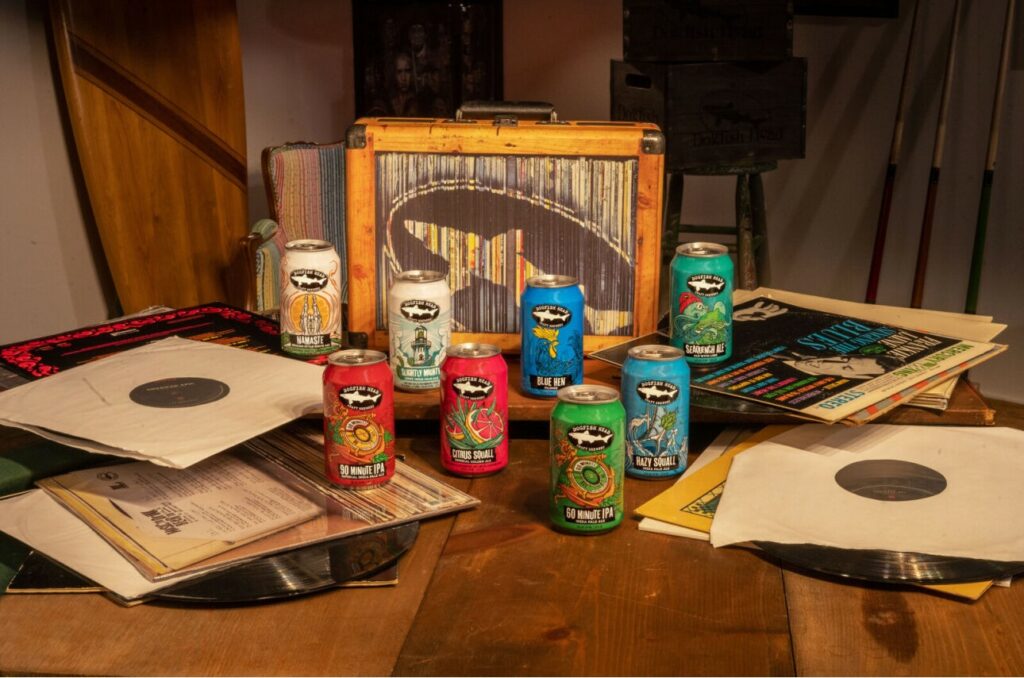
Which brings us back to Dogfish Heads’s artistic, musical and multi-talented founder, Mr. Calagione. After 20+ years, he realized that a new generation of craft beer afficionados were missing out on the stories behind his off-centered, award-winning beers. The problem was the lack of visual consistency across the portfolio.
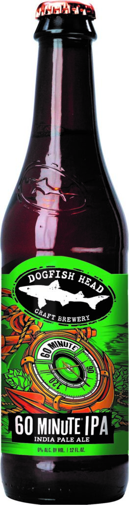
crisp, dynamic, black & white illustration that pops off the
shelf. The culinary ingredients are featured in a way that
says, “the beer you are about to enjoy has amazing
flavor.” All consumers drink first with their eyes. DFH’s
new look is an invitation to discover and experience beer
to the nth degree.
Calagione explained to Heady Times why change was needed.
“Today’s consumers don’t walk into a store knowing what beer they are going to buy. The decision is usually made on the spot. And you only have about three seconds to catch the eye of a shopper. That’s it. I realized that our amazing labels (which I absolutely LOVE) are all different. That lack of consistency made sense when we first started. It was central to the “off-centered” discovery experience that made hunting for a new craft [beer] really fun. And it worked when there weren’t so many choices on the shelf. Now it’s confusing, or worse… the message is lost. The essence of our beers and the world of music & clothing collaborations, record releases, discussion forums, books we created over the years… This body of work is a big part of the DFH experience, but our labels weren’t communicating that anymore. When the picture doesn’t tell the story, it’s time to create one that does. We are still the same gritty, passionate, story-telling company we have always been. You know, same as it ever was. Now with our new look, I’m confident that more people will discover what Dogfish Head is all about.”